Logo design and ideation for St. Louis Junior Roller Derby. They asked for a design to add to some shirts, and to use for stickers and other merchandise to sell at events. We decided to go with a simple, versatile logo design based on a skate wheel that could be easily scaled and colored depending on the situation.

Welcome packet design for new students and their families at St. Stephen Protomartyr Catholic School, home of “The Sharks”. The original materials were a hodgepodge of sheets in different formats and voices tossed together. The goal was to bring it all together in a unified, more polished presentation. View the entire document here.

The printed catalog for HDIS needed a new look, and they were looking for something less clinical and more modern. I recommended introducing warmer colors and adding vibrant photography that tells a story about the joy of living.

As the Bombers’ manager, so I had to come up with some uniforms. In an effort to defray the cost, I asked Das Bevo to sponsor, and then designed and produced the hats and shirts. The design was meant to be simple and readable with a nod to the sponsor’s existing brand identity.

Using their colors and fonts, this brochure for Nerinx Hall is meant to appeal to potential students, and their parents.

Since the standard business card size is almost equal to the size of a door hinge, this card for a carpentry business serves as a simple reference to the hinge and the turn of a screw.
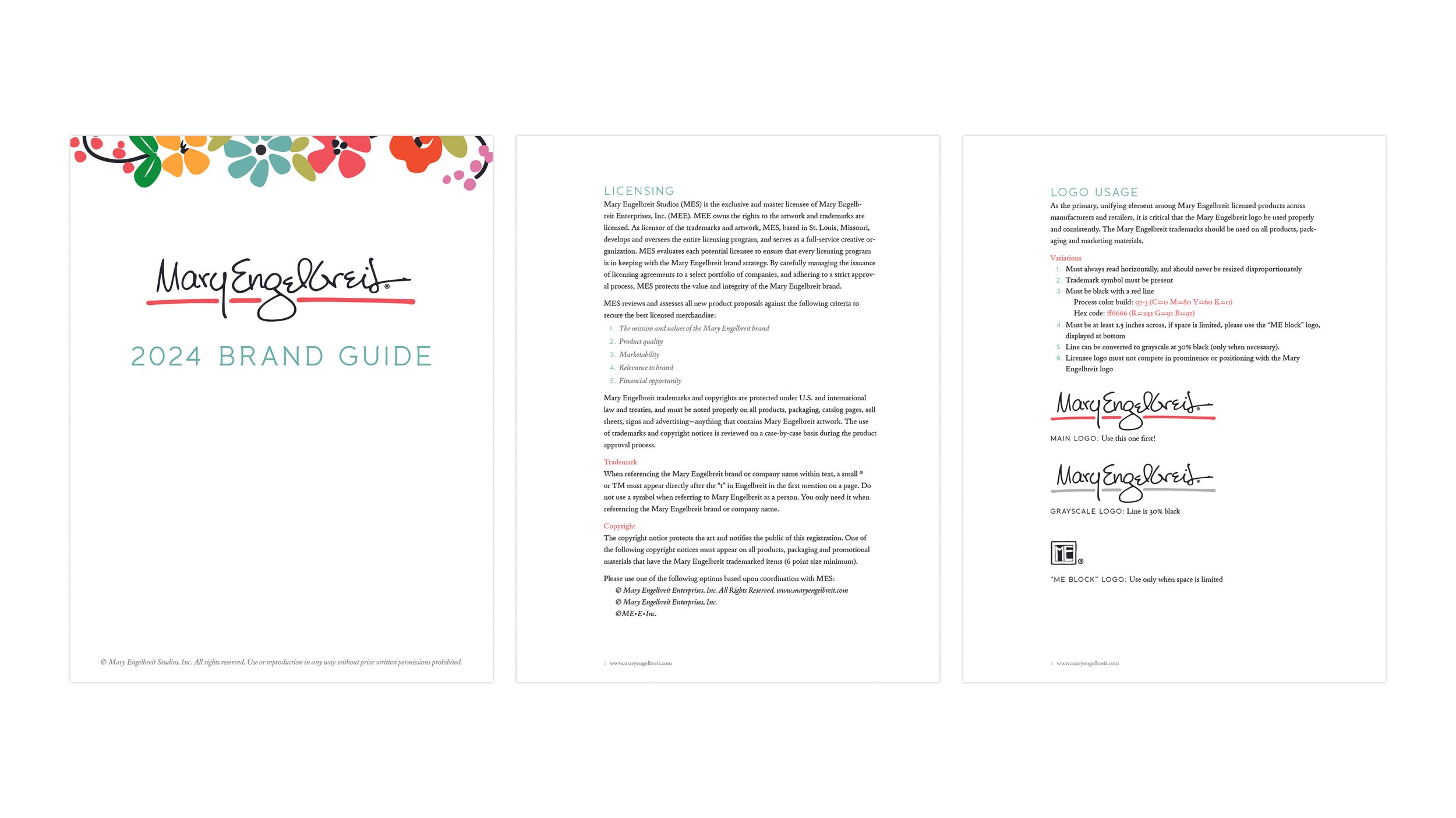
The brand guide for Mary Engelbreit Studios was designed and distributed to the licensees in an effort to maintain consistency across many different companies and products and answer questions regarding assets, packaging, copyrights, and more. See the full guide here.